Recipe App
Summary
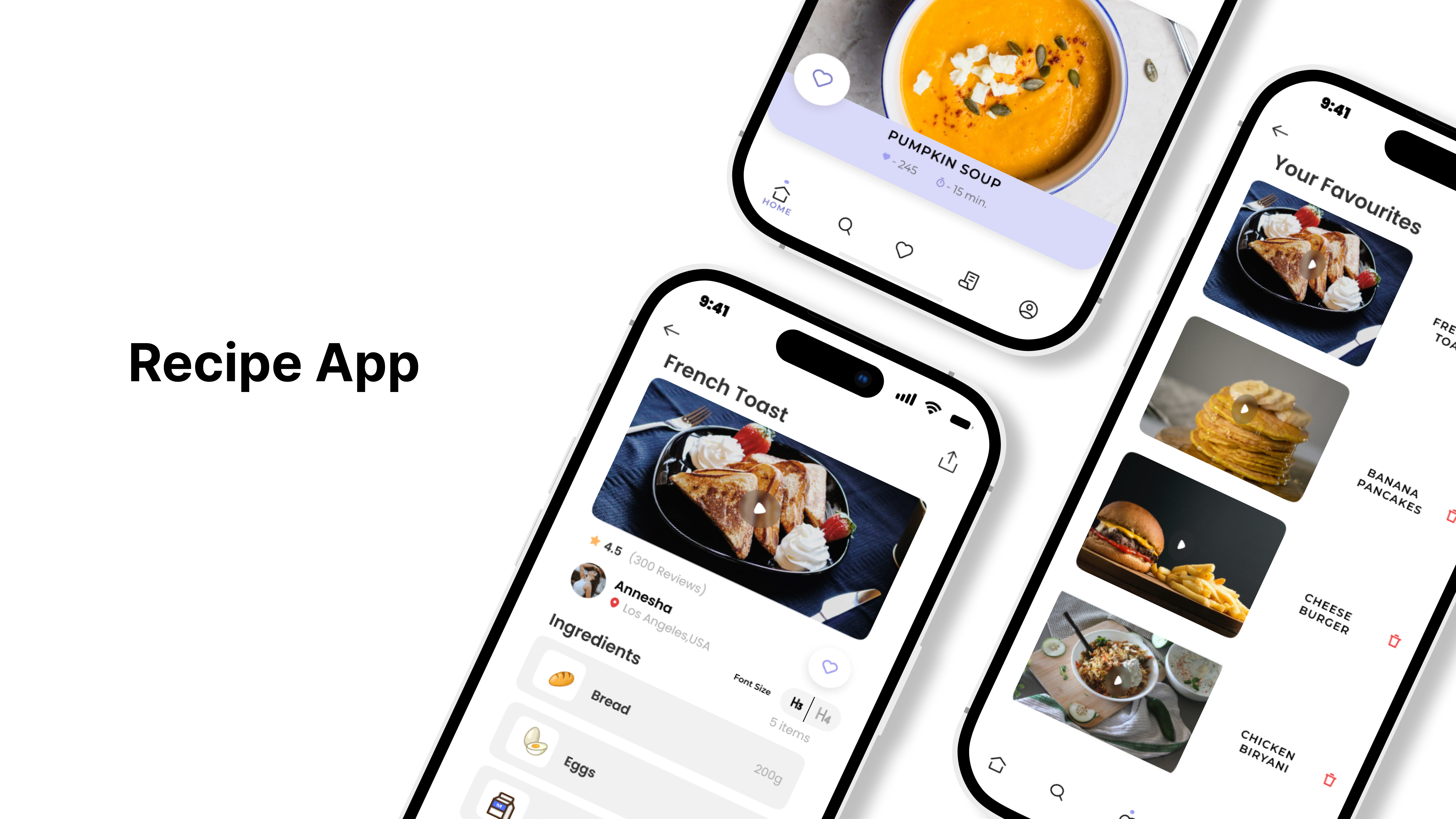
As part of the User Interface Design and Usability unit at Monash University, I collaborated with a small team to design a mobile recipe app. Our aim was to help users tackle the challenges of preparing cost-effective and nutritious meals. The project centered on crafting a user-friendly experience, making it possible for even beginners to easily navigate and manage complex culinary information on their mobile devices.
Problem
- The rising concerns about the cost of living and the need for affordable, wholesome meals.
Challenge
- Our goal was to deliver a prototype that enables users to search for recipes based on specific criteria like dietary requirements, cost per serve, or key ingredients.
User Research
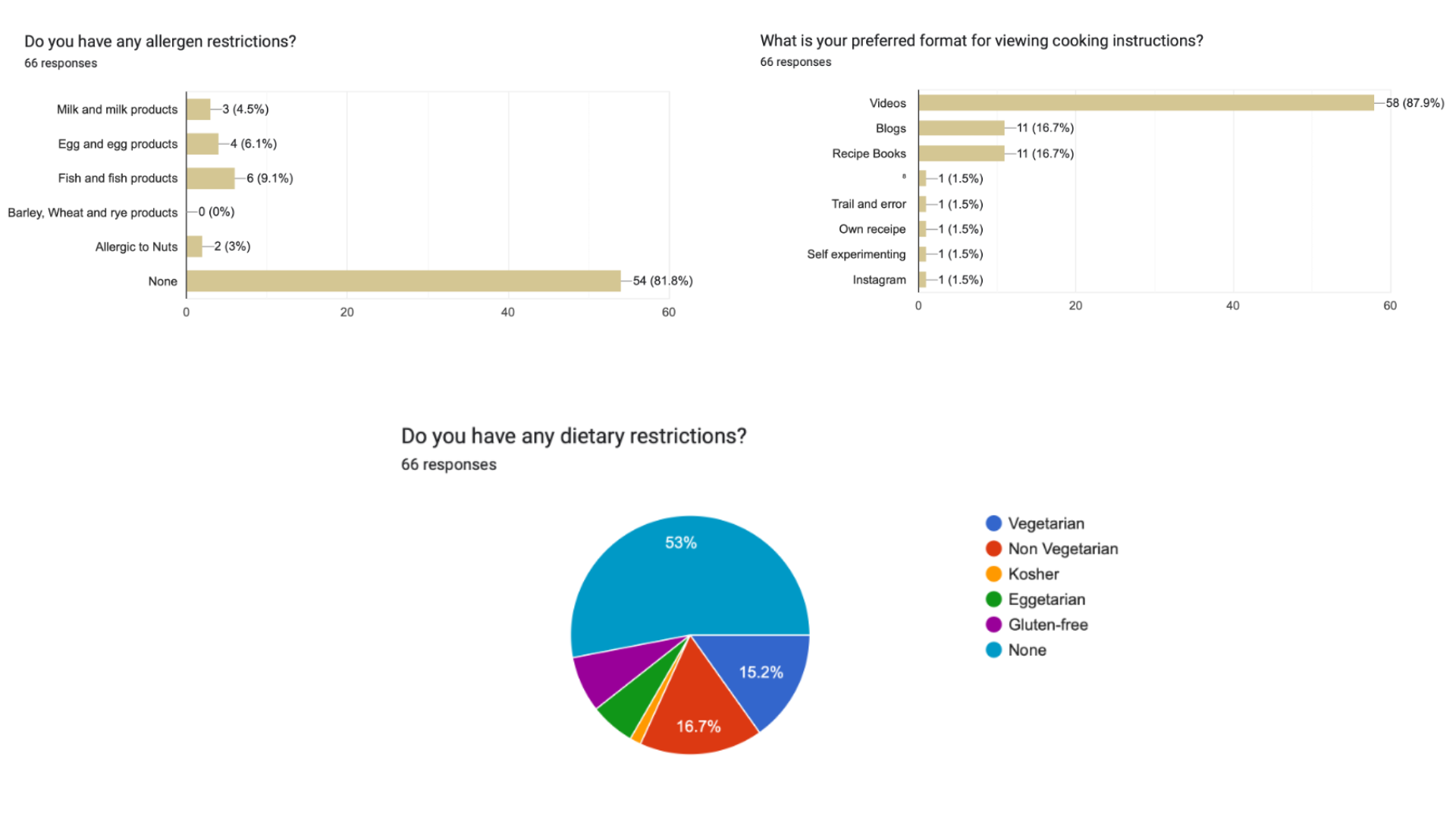
Conducting user research for our cooking application revealed crucial insights into user demographics, behaviors, and preferences. The diverse data collection through Google Forms provided a comprehensive understanding of our potential users and their habits in the culinary domain.
Key Findings:
- Demographic Diversity:
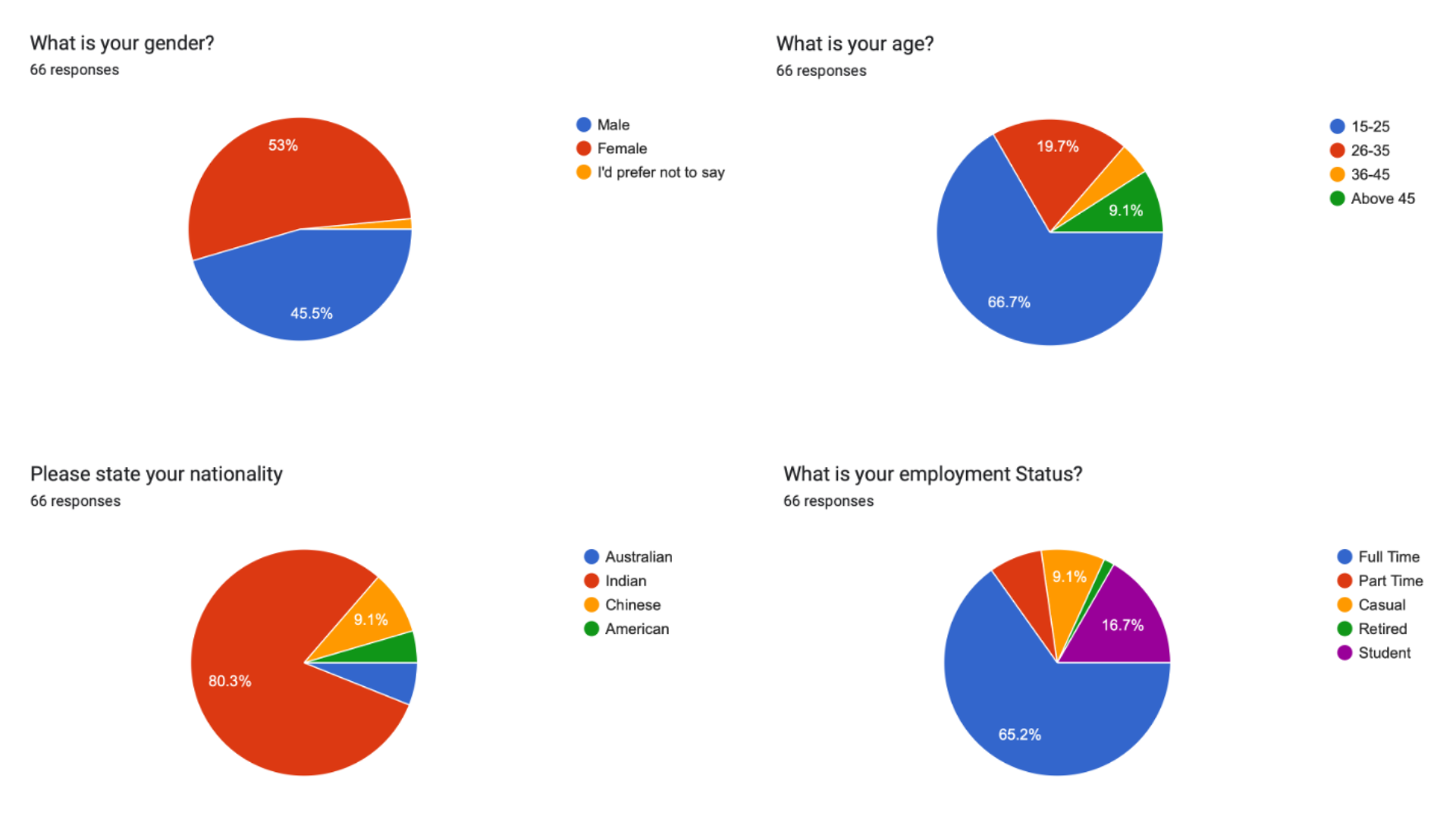
- Respondents displayed a nearly equal gender split, with a predominant age group of individuals under 25, highlighting a technological age disparity.
- The majority of participants were of Indian origin, with a significant representation from the Information Technology sector.
- Shopping Habits:
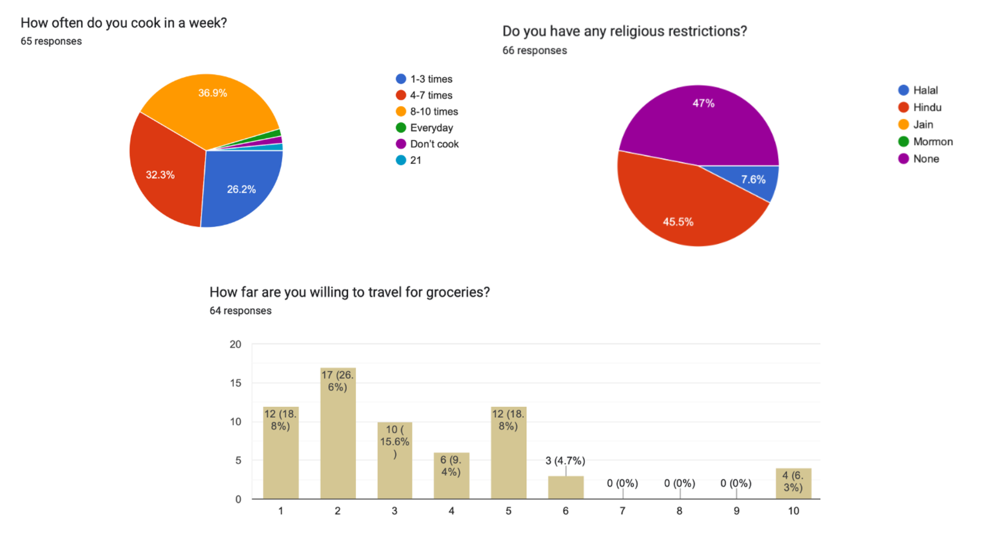
- Despite tech-savvy backgrounds, a substantial number preferred sourcing ingredients from local grocers over online supermarkets.
- Budget-consciousness was evident, as most respondents fell within the "less than 40 dollars" category for weekly grocery spending.
- Cooking Patterns:
- A diverse range of cooking frequencies emerged, with a notable preference for cooking more than eight meals a week.
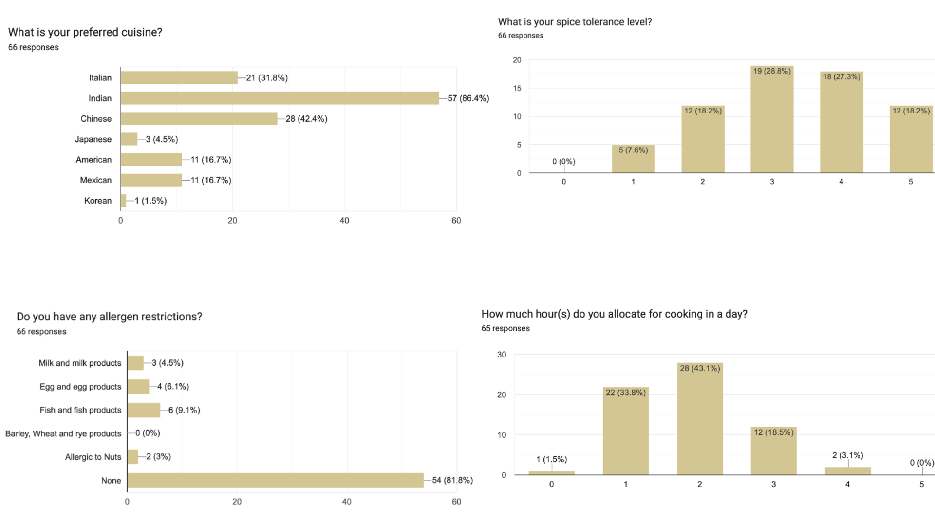
- Time spent on meal preparation varied, with over 75% dedicating 1-2 hours, reflecting a balance between convenience and home-cooked meals.
- Cuisine Preferences:
- Indian cuisine dominated preferences, followed by Chinese and Italian, showcasing a correlation with the respondents' origin and influence of popular fast-food chains.
- Dietary Restrictions:
- A significant portion of respondents had no religious restrictions, while Hindu and Halal restrictions were present among others.
- Spice tolerance was generally high, aligning with the main demographic of users accustomed to spicier foods.
- Content Consumption:
- Viewing cooking videos emerged as the preferred format, aligning with contemporary preferences for visual content over traditional methods like blogs or recipe books.
- User Suggestions:
- Respondents suggested features such as recipe sharing, a blogging section, interactive questionnaires for taste preferences, and a calorie tracker, emphasizing the importance of social and personalized elements in the app.
Design Process
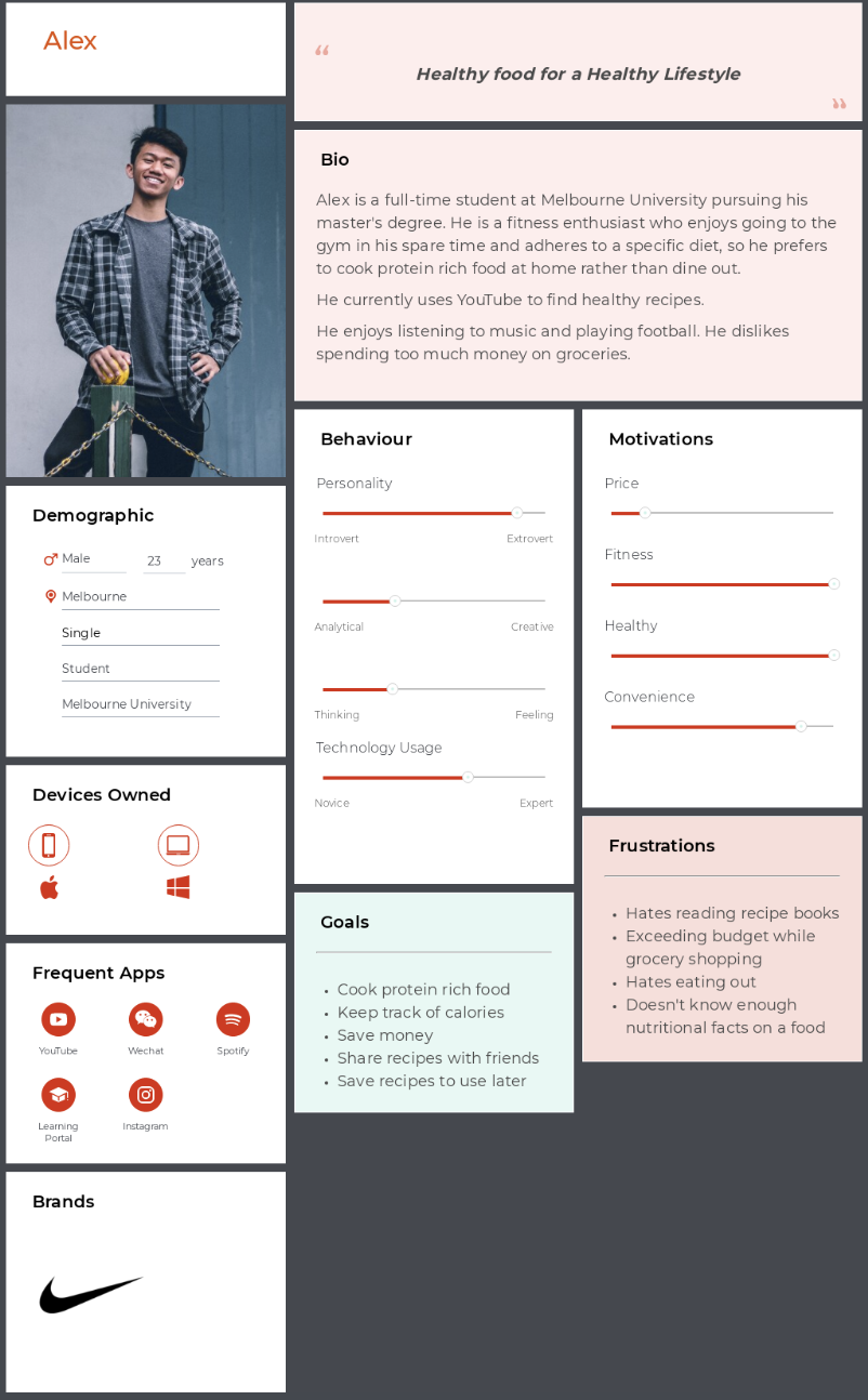
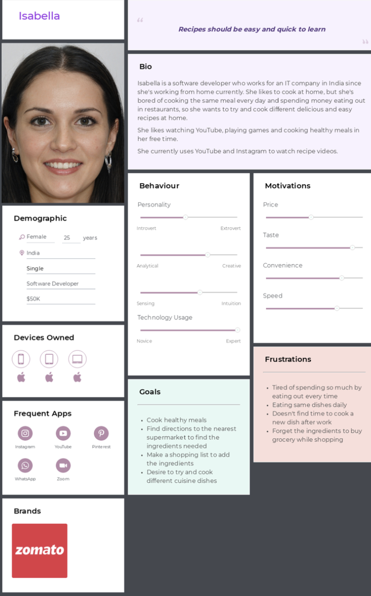
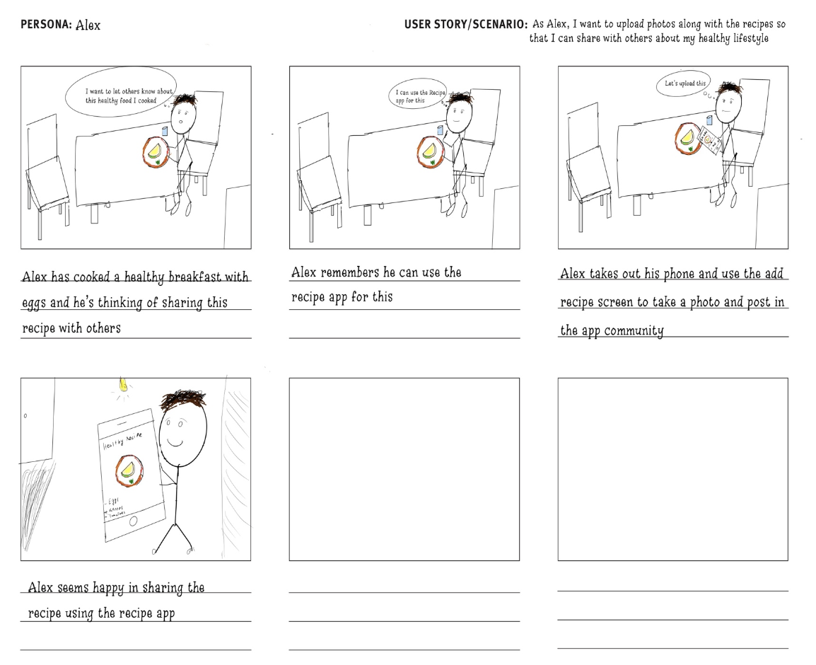
The design process involved creating user personas, MOSCOW analysis, Storyboards, low-fidelity and high-fidelity prototypes
MOSCOW
Persona
Story Boards
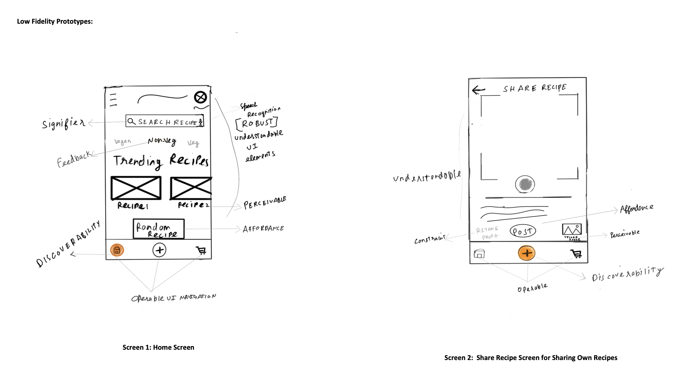
Low Fidelity Prototypes
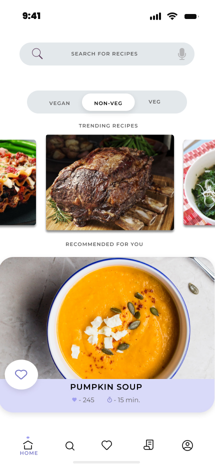
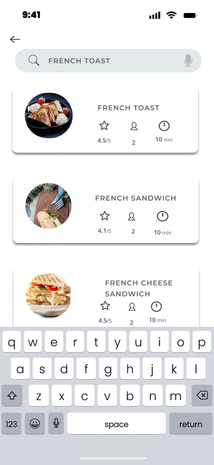
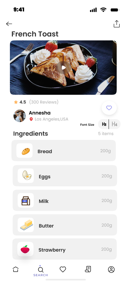
High Fidelity Prototype Images
Heuristic Evaluation
We utilized Nielsen's heuristics to evaluate our recipe app prototype, aiming to identify design flaws before user deployment. This involved applying a set of rules to assess the usability of the prototype screens, ensuring they align with recognized usability criteria.
Instances of Compliance:
- Clear Navigation Feedback: The bottom navigation bar effectively communicates the current screen status, enhancing user awareness.
- Icon Consistency: Icons in navigation and recipe viewer screens adhere to real-world conventions, promoting user understanding.
- Hierarchy Tracking: The bottom bar menus contribute to tracking navigation hierarchy, reducing memory load.
- Aesthetic Design: The Home screen follows a simple and aesthetic design, balancing visual elements without overwhelming details.
Instances of Violation:
- Lack of Help Section: The absence of a help and documentation section represents a violation, suggesting the need for an easily accessible help icon.
- Confirmation Alert Missing: The absence of a confirmation alert and undo option for the "like" action is identified as a violation, impacting user control and freedom.
- Filter Option Absence: The lack of a filter option in search violates flexibility and efficiency principles, hindering users from excluding certain recipe ingredients.
While the app demonstrates adherence to several heuristic principles, identified violations, particularly the absence of a search filter, pose usability challenges. These findings emphasize the importance of refining user interface elements for improved user control and efficient information retrieval.
Conclusion
Throughout this project, my involvement in the Recipe App design and development has been extensive and transformative. Utilizing an array of user research methods, including in-depth interviews, comprehensive surveys, and rigorous usability testing, I was able to gain invaluable insights into the user's needs and preferences.
This project involved an iterative design process where initial wireframes were developed and continually refined according to the feedback recieved from our tutors. These low-fidelity protypes evolved into detailed prototypes with a focus on Norman's Design principles, which were meticulously crafted using Figma. This allowed for a dynamic and responsive design which offers an intuitive, engaging, and efficient platform for users to explore and manage recipes.